Project Rescue Mission
PROBLEM SPACE
UC Health, a $5 billion dollar regional healthcare system, had built a long-term relationship with a trusted agency vendor.
Unfortunately, the agency had delivered a subpar design solution for their primary digital property, a site that attracts over 200,000 visitors per month.
They needed a rescue.
In August 2021, Forbes named UCHealth as the No. 1 employer in Colorado.
PROJECT GOALS

Improve the quality of the new UI

Improve menu access & increase capacity

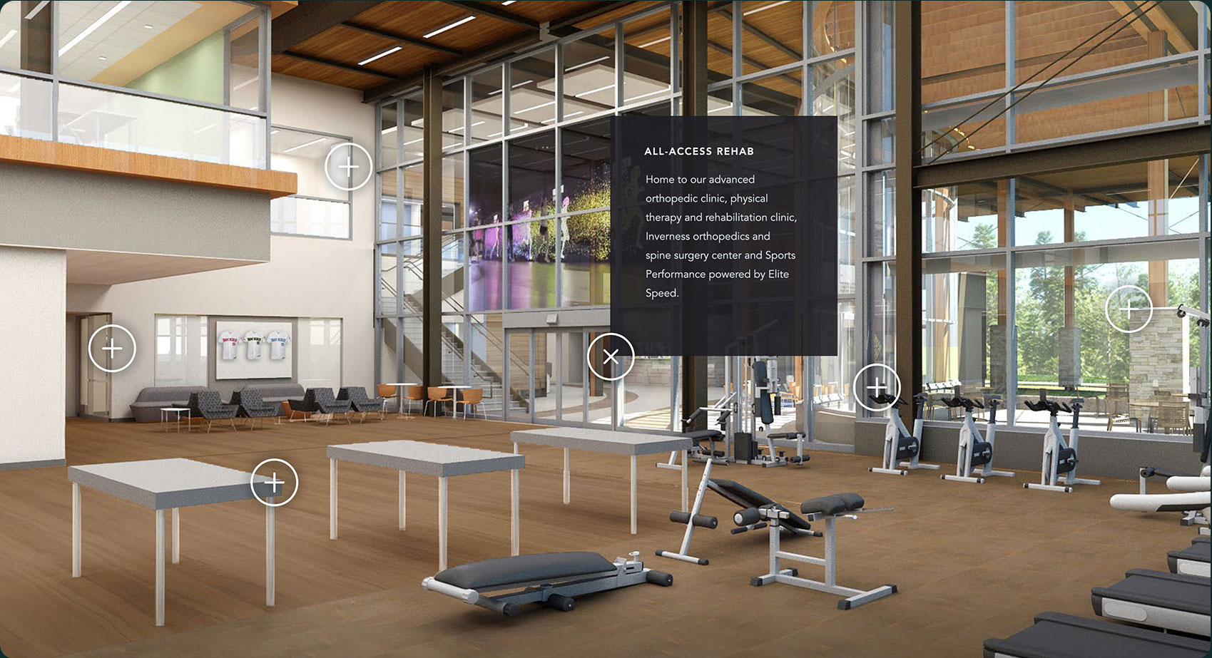
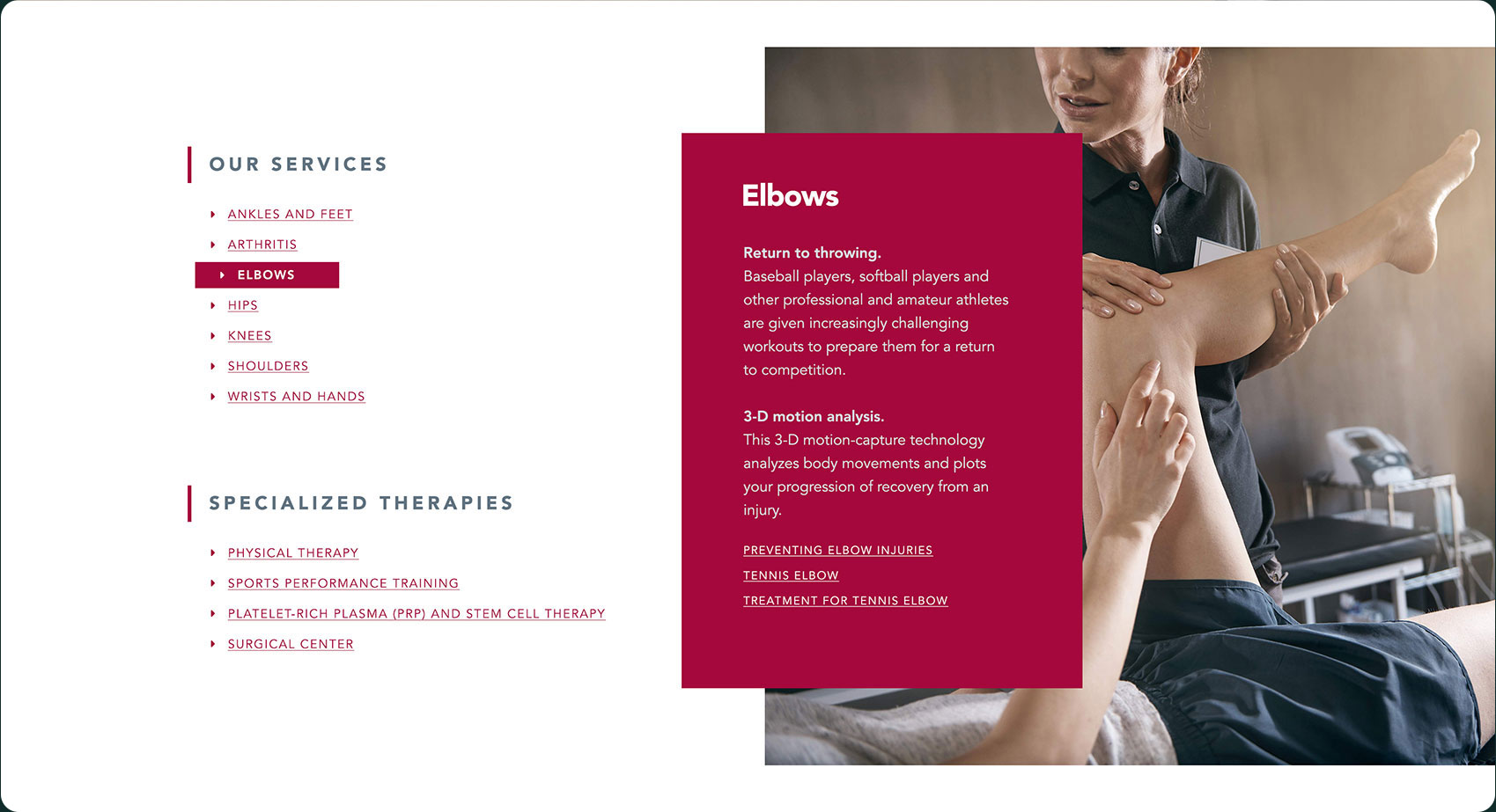
Promote new construction & facilities
JUST UNDER THE SURFACE
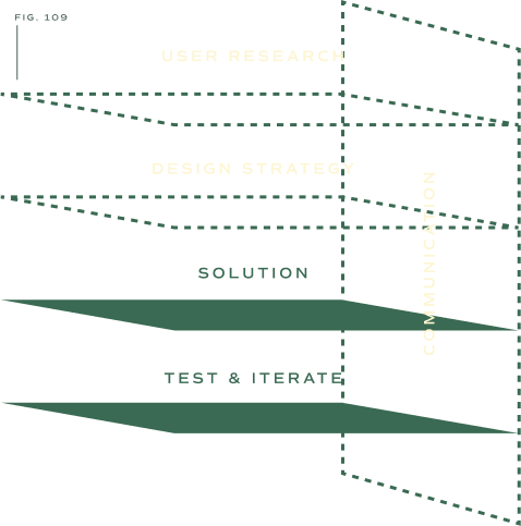
Fig. 109—Key structural gaps in process
In addition to their stated concerns, hidden just under the surface were a set of challenges that also needed to be addressed.
First, there had been zero research and very little planning conducted before the agency design was produced, so a gap in understanding user and stakeholder needs existed.
And second, there was poor communication between the digital team, the leadership team, and the agency. The process produced a lot of opinions, but poor alignment and shallow rationale.
MOVING FORWARD TO GO BACKWARD
The strategy was simple, but risky. Under the guidance of the product owner, I began by conducting stakeholder interviews and creating a v2 homepage design immediately as if I were continuing the process already in progress.
It isn't often I agree to design without objective research as the foundation of our understanding, but I reluctantly decided to move forward to go backward. I was called to the table for my visual design prowess, so it was important to deliver.
Then, I planned to mold the design into a more human-centered solution through a research-based and iterative process that involved and aligned all parties involved.
Spoiler alert: It worked.
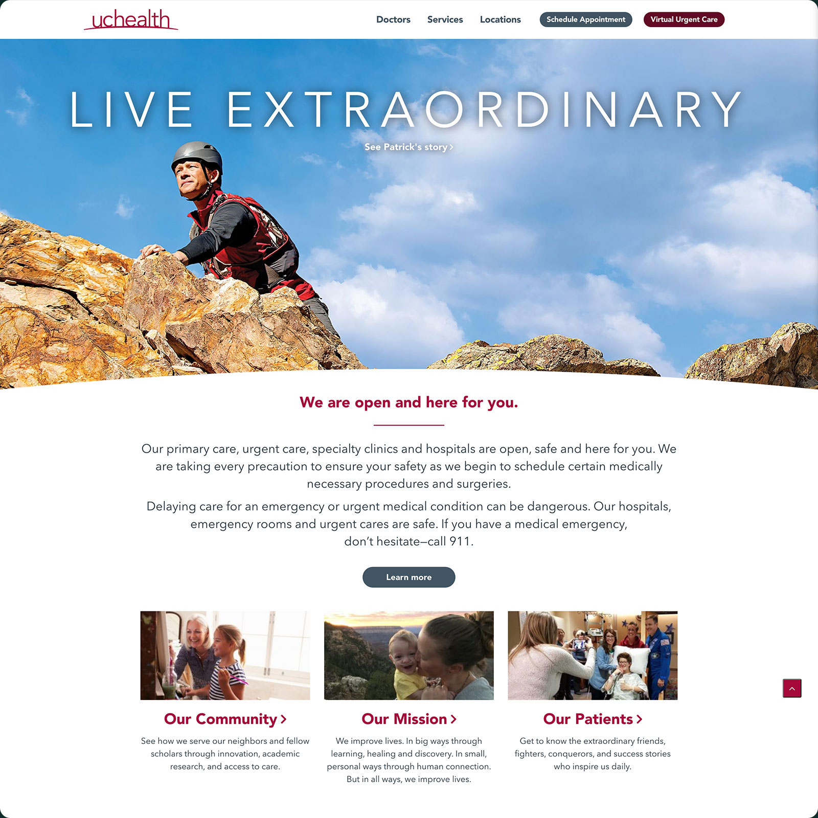
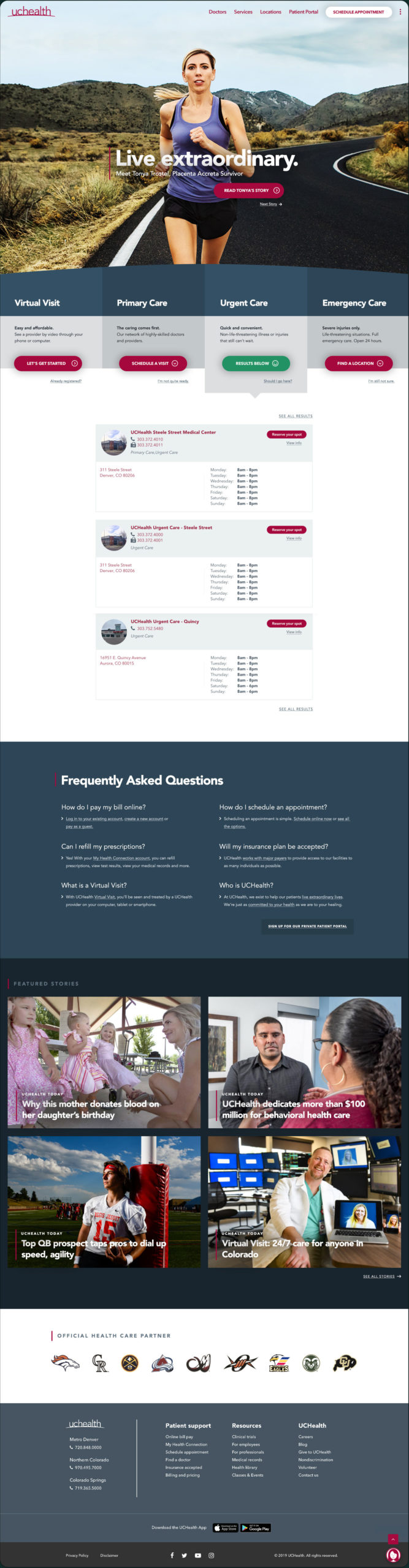
BEFORE
The existing data on user behavior showed lacklustre interaction with the content.
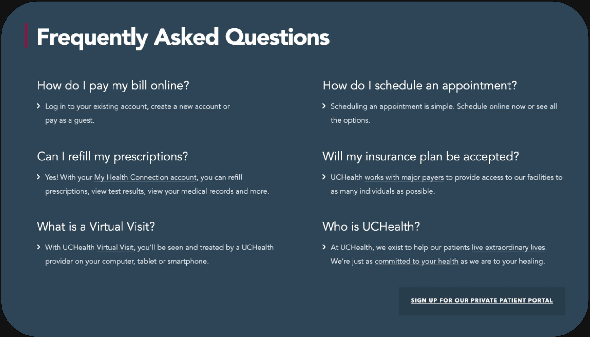
With an ego-centric content strategy that prioritized their own content over offering help, I made an educated guess that people were left wondering,
"So, where is all the stuff I actually need?"
I advocated for prioritizing user needs.
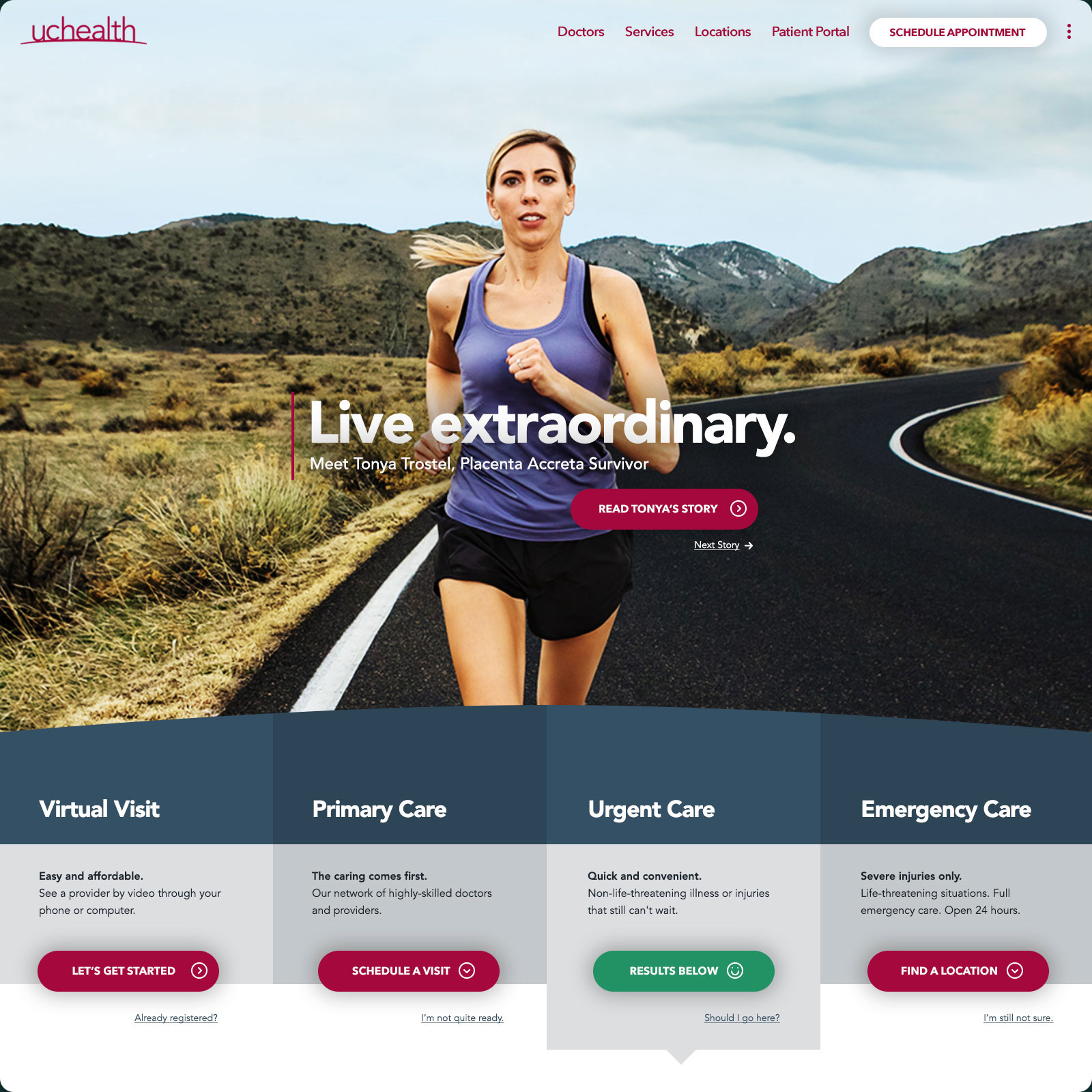
AFTER
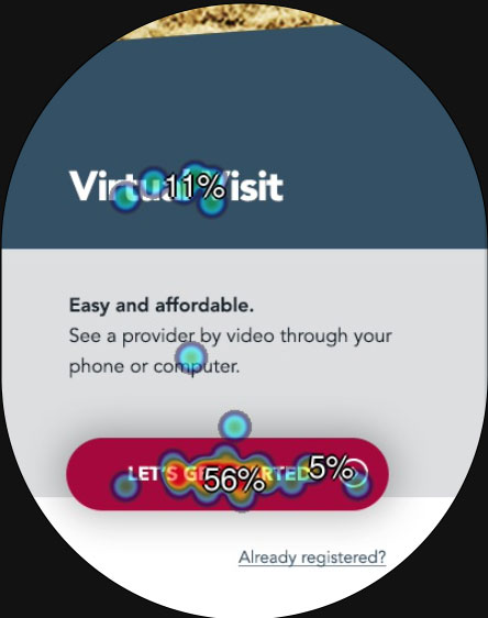
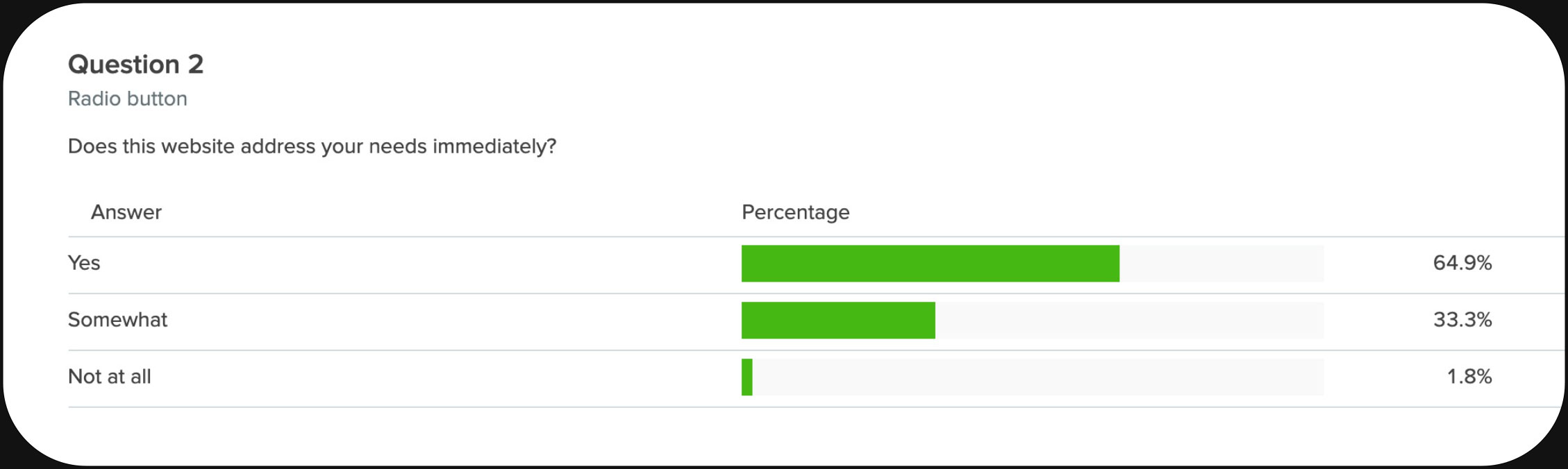
Self-serving content has been replaced by patient-focused features, and it paid off. During testing, I received waves of validation.
A larger, cinematic billboard approach appeased all the stakerholders, including the client's agency.
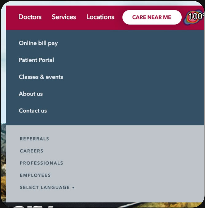
And a kabob menu gives users access to other important elements without converting primary navigation to dropdowns. (Editor's note: See learnings.)
❮ DRAG CENTER LINE TO REVEAL ❯
HOW WE DID IT
METHODS & DELIVERABLES (8 WEEKS)
Comprehensive discovery
Stakeholder research
C-suite board pitch
Responsive website design + iterations
Mobile website design + iterations
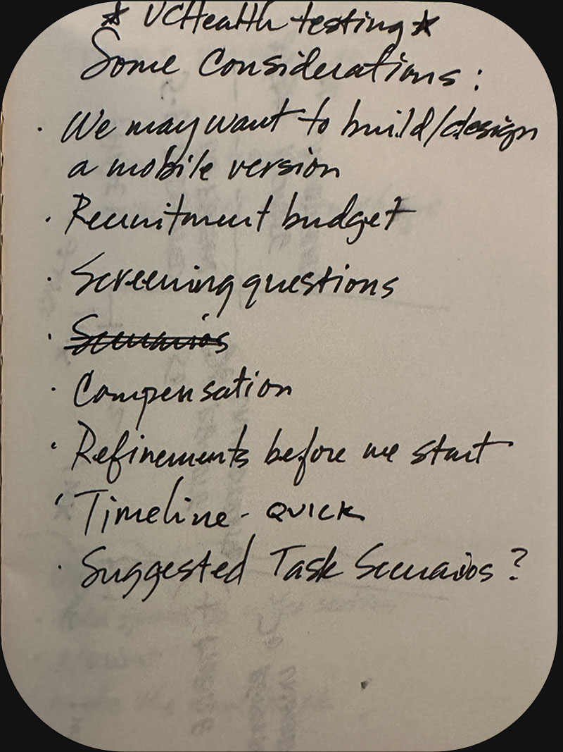
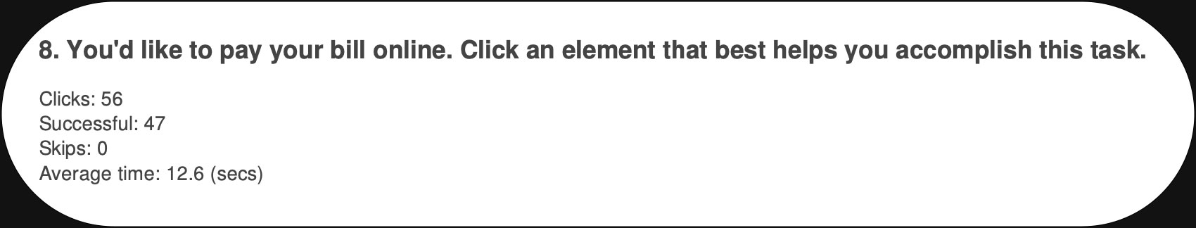
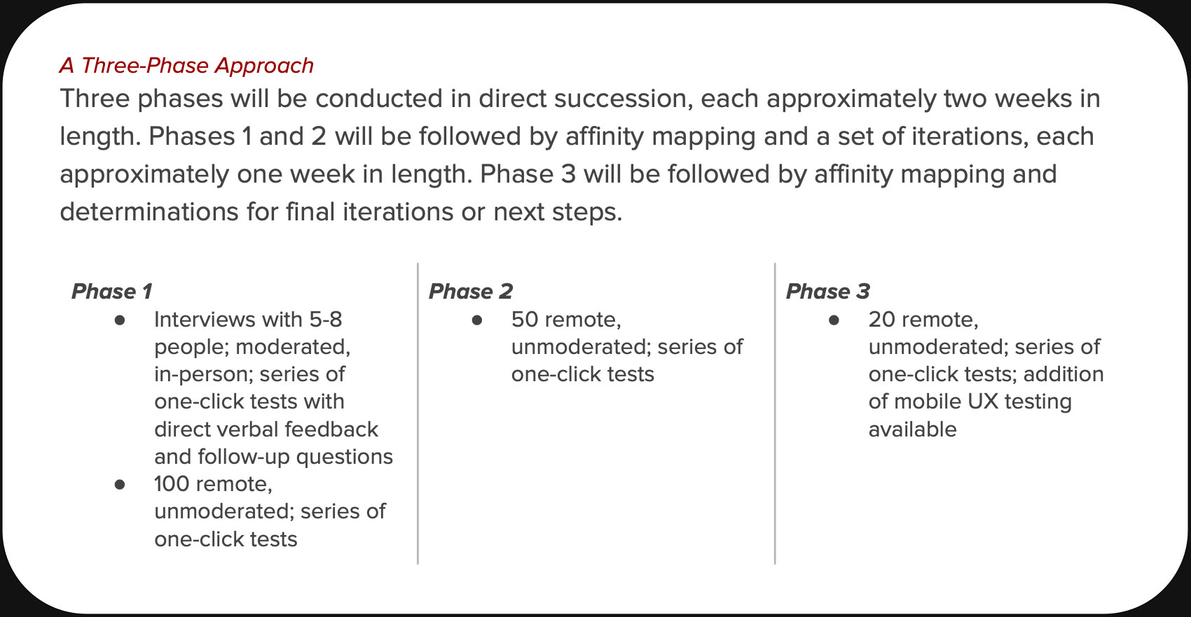
3-Phase research plan
User testing recruitment + pre-screening
9 Moderated user tests, on-site
171 Unmoderated user tests, remote
10 Card sort studies, remote
Affinity mapping, on-site
Feature prioritization, on-site
Data analysis
TAKE A PEEK
[+] USER TESTING PLAN
[+] INTERVIEW SCRIPT
[+] NON-DISCLOSURE AGREEMENT
[+] PRE-INTERVIEW QUESTIONNAIRE
[+] TEST RESULTS, MODERATED
[+] TEST RESULTS, UNMODERATED
[+] PRE- & POST-STUDY RESULTS
TOOLS
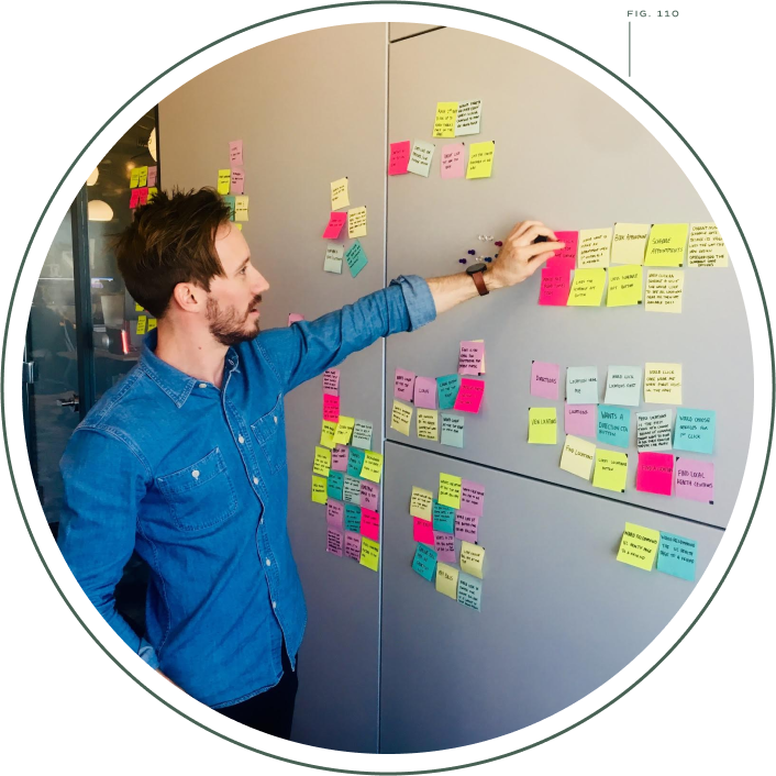
Fig. 110—Jason and Matt collaborating on our research

Innovation in the Rescue
BUSINESS IMPACT
While UCHealth is pretty tight-lipped about their actual numbers, they did have this to say:
"Matt is a visionary creative professional who possesses a unique ability to grasp the bigger picture and execute designs that support a seamless customer experience. His methodical and efficient approach to projects results in market-differentiating solutions.
"The recent overhaul of the home page and main navigation, under his direction, led to a noticeable improvement in key metrics and a positive impact on vital business segments."
—Vincent Serio, Senior Director, Digital Marketing & Emerging Media
LEARNINGS
Ah, the kabob menu. Unfortunately, the shift opened up a queue of requests "to be included in the menu" that still hasn't been closed.
At a critical juncture, I decided to use a different vendor for our unmoderated user recruitment—a misstep that caused apologies, delays, and rework.
In retrospect, I would have liked to have enabled a UCH digital team member in user testing for continuous learnings.
Successful reconciliation between a large corporation and a large agency is tough, but I made it happen. They continue their relationship today.
DESIGN HIGHLIGHTS

// CREDITS //
Voyage is the consulting collab of Matthew Reiswig and friends solving problems and blowing minds since forever. | Read at Medium. Connect at LinkedIn.
Futura Bold by Linotype. Neutra Text Book by House Industries. Commuter Sans by Dharma Type. | All illustrations created by Artificial Intelligence.
© Copyright 2024, All rights reserved